GWC x Layer Zero: Making a blog using HTML and CSS!
Styling a blog using HTML and CSS with Girls Who Code!
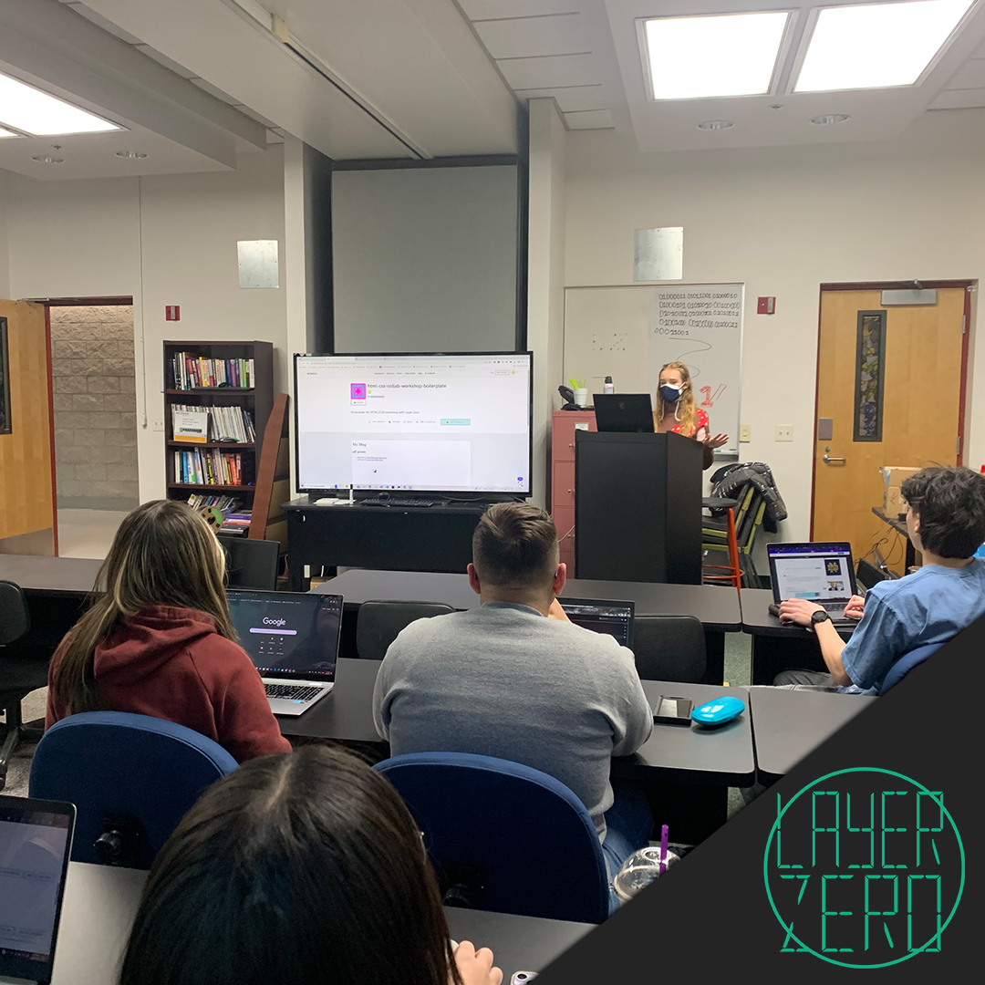
GWC x LayerZero Workshop 2
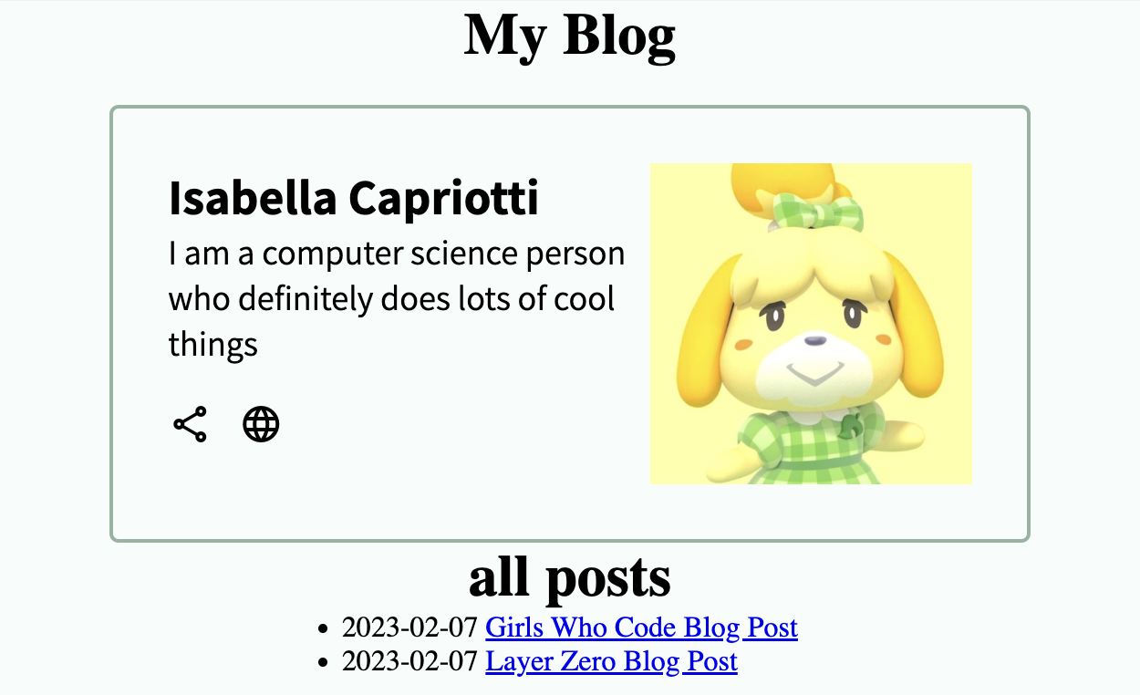
Isabella demonstrated an example blog of the final product, a very cute yet simple enough design for beginners. Everyone started off with a boilerplate HTML and blank CSS file and Isabella began to go through step-by-step how to add the elements for the blog and what they each did. The people following along got to pick their own color pallet, write their own message, and chose the picture they wanted to have on their blogs.
Everyone seemed to have a great time learning about HTML and CSS and Isabella did a great job teaching the concepts. Glitch was a great platform to work off of and If anyone wants to make their own blog as well, we will include the information from the workshop here.
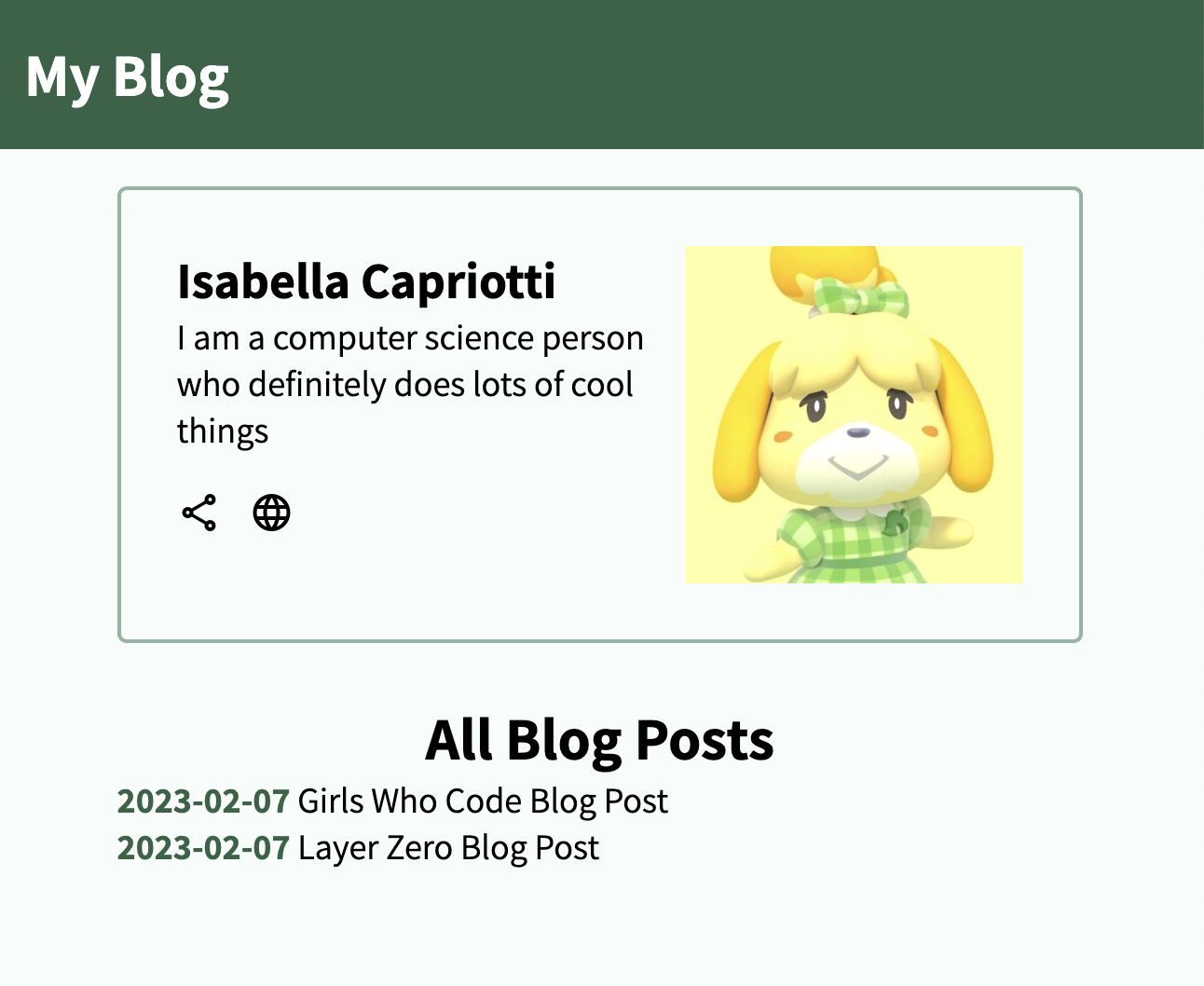
Let’s make a blog using HTML and CSS!
We will be creating the homepage of “My Blog”. Afterwards, you will be able to practice your skills by styling the “Girls Who Code Blog Post” and “Layer Zero Blog Post” pages.
This is what we’ll be working on today!
Starting with the boilerplate
The boilerplate code can be found at index.html.
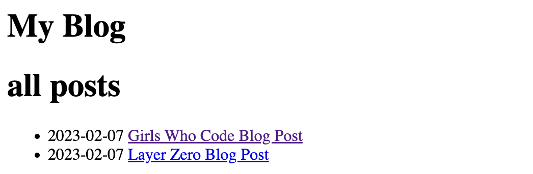
The boilerplate code is quite plain, so let’s add a bio and some styles to make it look presentable!
Initial styling
Before we start, import our css file in index.html.
Place this line of code inside <head>:
<link rel="stylesheet" href="css/style.css" />
Let’s also define some spacing attributes for our elements as well as the theme colors we’ll be using for this project.
*{
	box-sizing: border-box;
  margin: 0px;
  padding: 0px;
  --green-dark: #316346;
  --green-light: #94b3a1;
  --ivory: #f7fcfa;
}
Inside the body, we have a main div container with the class class="page-content". We can think of this as the baase layer of the page.
- Inside
style.css, let’s make the width and height ofpage-contentequal to 100% of the view-height and 100% of the view-width. This will ensure that the background will cover the entirety of the view.width: 100vw; height: 100vh; - Change the background color to a color of your choosing.
background-color: var(--ivory); -
Make sure everything contained inside
mainis stacked and also centered. We can use the flex properties to do so.display: flex; flex-flow: column; align-items: center;
Adding a biography
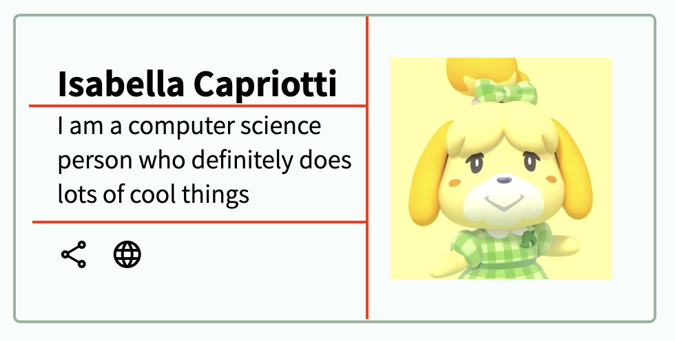
If we take at a look at our div with the id id="profile", we can divide the box into 2 columns, where the first column has 3 rows.
- Inside our
profilediv, create a div with the classclass="col". -
Create 3 additional divs with the class
class="row"inside the col div.Inside the first row div, add a header (
h2) element with your name.In the second row div, add a paragraph (
p) element with a sentence or so about yourself.In the last row div, create two button elements. You can choose different icons using Google’s Material Symbols which we already have imported in the
<head>. Look through the documentation to see how to use them. - After the col div, add an image element for your profile picture.
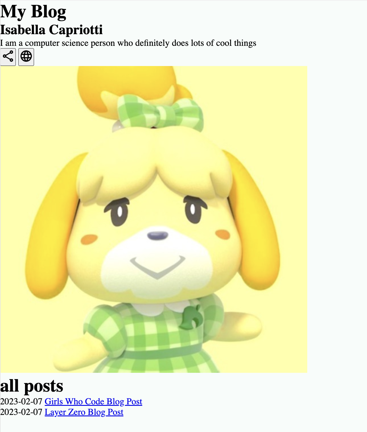
<div id="profile">
  <div class="col">
    <div class="row">
      <h2>Isabella Capriotti</h2>
    </div>
    <div class="row">
      <p>Description</p>
    </div>
    <div class="row">
      <button>
        <span class="material-symbols-outlined">
					share
				</span>
      </button>
      <button>
        <span class="material-symbols-outlined">
					language
				</span>
      </button>
    </div>
  </div>
  <img src=""/>
</div>
We’re getting there! It’s a little messy but we’ll clean it up with styles.
Creating the border
-
First let’s add a border around the profile and also round the edges.
border: 2px solid var(--green-light); border-radius: 5px; - Add some space between the box and the inside content by changing the padding.
padding: 30px; - We also don’t want the profile box to be too big so lets shrink it by making the width
width: 80%;
Columns and rows
We will use the flex properties to style the columns and row.
-
Add the following flex attributes to
#profile. This will put the content inside the columns next to each other, rather than stacked on top of one another.display: flex; flex-flow: row;
Resizing the picture
Our image is way too big. We will style the image so that it will be resized to stay within the borders as we change the window size. Since we only want to resize the image inside the profile, we can select that element by declaring #profile img {...} in the css file.
-
Contain the image and change the width. You may want to experiment with different percentages depending on the size of your image. In our case,
40%was a safe bet.object-fit: contain; width: 40%;
Styling the text
For text, you can change the font-family, font-weight, and font-size. Since we already have the Assistant font family imported inside <head>, we can use that.
- Play around with the three attributes on the
h2andpelements.
Styling the buttons
-
You can change how the buttons are aligned with the
align-selfattribute. We will useflex-start.align-self: auto | **flex-start** | flex-end | center | baseline | stretch -
Add some space around the buttons by changing the margin.
margin-right: 15px; margin-top: 20px; -
You can remove the button border and background by setting:
border: none; background: transparent;
.row{
display: flex;
  flex-flow: row;
}
.col{
display: flex;
flex-flow: column;
}
/* Profile */
#profile{
display: flex;
flex-flow: row;
border: 2px solid var(--green-light);
border-radius: 5px;
padding: 30px;
margin-top: 20px;
width: 80%;
}
#profile img{
object-fit: contain;
  width: 40%;
}
h2{
font-family: 'Assistant', sans-serif;
font-weight: 700px;
font-size: 1.7rem;
}
#profile p{
font-family: 'Assistant', sans-serif;
font-weight: 500px;
font-size: 1.2rem;
}
#profile button{
align-self: flex-start;
margin-right: 15px;
  margin-top: 20px;
border: none;
  background: transparent;
}
Styling the header
- Change the background color of
headerelement and the text color (color) to white. - Make the background color span the entire width of the page by changing the width to
width: 100%; -
Change the height of the colored block using view-height (
vh). We also want to define a minimum height in case the window size is changed by adding a minimum height,height: 10vh;min-height: 80px; -
If we wanted to add more elements to the header (like buttons, images, or more text), we can horizontally align them next to each other with
flex. Not defining this would cause the additional elements to be stacked vertically. (This will be useful later.)display: flex; flex-flow: row; align-items: center; - Add some padding around the text to give it some space from the edges,
padding: 15px; - Again, you can change the
font-family,font-weight, andfont-sizeof the header text. Play around with the three attributes on theh1element.
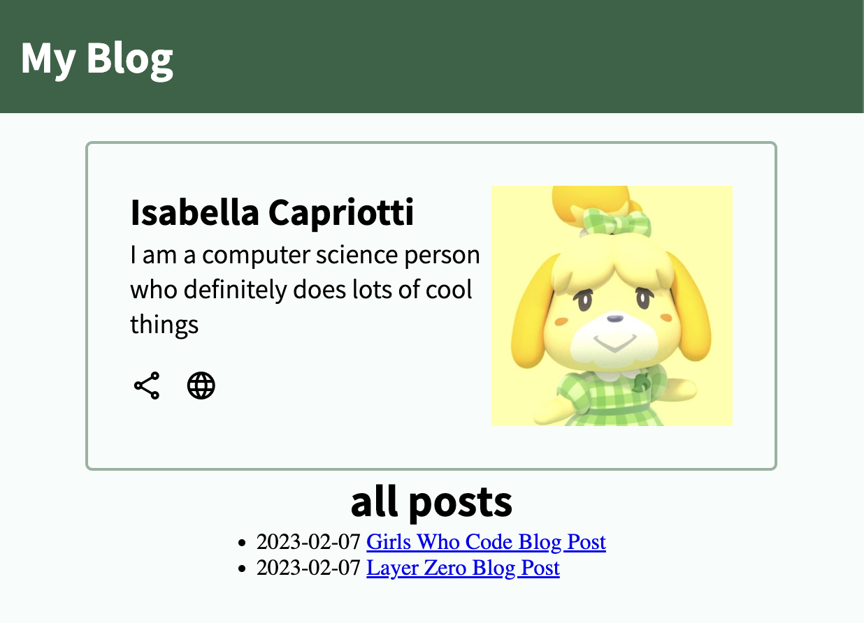
header {
background-color: var(--green-dark);
color: white;
width:100%;
height: 10vh;
min-height: 80px;
display: flex;
  flex-flow: row;
  align-items: center;
}
h1{
font-family: 'Assistant', sans-serif;
font-weight: 700px;
font-size: 2rem;
}
Styling the blog posts
Firstly, let’s surround the blog posts with a div container with the id id="blog-posts". This will act as the base layer.
<div id="blog-posts">
  <h1>All Posts</h1>
  <ul>
    <li>
      <span>2023-02-07</span>
      <a href="/blog/gwc.html">Girls Who Code Blog Post</a>
    </li>
    <li>
      <span>2023-02-07</span>
      <a href="/blog/layerzero.html">Layer Zero Blog Post</a>
    </li>
  </ul>
</div>
Similar to profile-content, let’s define the foundational styles for the div blog-posts.
- We don’t want the blog posts to run across the entire screen so set the width to 80%.
-
Make sure items are left-aligned and stacked on top one another, as opposed to next to each other, by adding adding these flex properties:
display: flex; flex-flow: column; align-items: flex-start; - Add spacing between the profile and the blog posts by changing only the top margin,
margin-top: 30px;
Styling the blog post title
-
Center the text of the
h1element insideblog-postsby addingalign-self: center;
Styling the unordered list
- Play around with the different text attributes on the
ulelement. - Let’s also remove the bullets by setting
list-style-typetonone.
Finishing touches!
- Remove the blue color and underlining of the links by setting
text-decorationtononeand the text color to black on theaelement insideblog-posts.
It might be hard to discern whether or not the text is a link, so let’s change the text color when we hover over the link. We can change the style of a link when hovering over it by targeting #blog-posts a:hover {...}.
- Change the text color of the element
a:hover. - You can also change the cursor type. Set the cursor to
cursor: pointer;to make the links more distinctive.
Let’s also change the style of the dates to make it pop.
- Add the class
class="darker-text"to thespanelements that contain the dates. - Once again, play around with the text color and the font attributes.
#blog-posts{
  width: 80%;
  display: flex;
  flex-flow: column;
  align-items: flex-start;
  margin-top: 30px;
}

#blog-posts h1{
  align-self: center;
}

#blog-posts ul{
  font-family: 'Assistant', sans-serif;
  font-weight: 500px;
  font-size: 1.2rem;
  list-style-type: none;
}

.darker-text{
  color: var(--green-dark);
  font-weight: 700;
}

#blog-posts a{
  text-decoration: none;
  color: black;
}

#blog-posts a:hover{
  color: var(--green-dark);
  cursor: pointer;
}
Congratulations! You created the homepage 🎉
Now, it’s your turn!
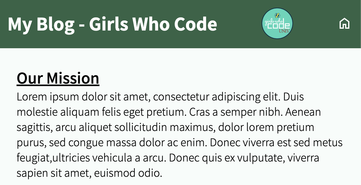
Using the boilerplate code in the file blog/gwc.html, replicate what you see above.
Similarly, do the same for the file blog/layerzero.html.
Good luck!